Wednesday, 1 June 2016

How to Create a Winning A/B Testing Strategy

Sometimes, despite your best efforts, your A/B testing just doesn’t seem to work. You run test after test and nothing seems to improve your conversion rate in a meaningful way.

Or, worse, your new pages actually decrease your conversion rate.

In your search for A/B testing success, you’ve read countless case studies and incorporated their findings into your variants…and still, nothing.

Maybe you’ve had a few token successes, but those either didn’t reach statistical significance or simply didn’t improve your conversion rate enough to make a real difference to your company.

What are you doing wrong?

The good news is, you’re not the only one with this problem. If you’ve tried A/B testing, you’ve almost certainly had that moment when you look at your results and think, why isn’t this working?

It’s a frustrating situation, but the fact of the matter is that the majority of A/B tests don’t improve conversion rates. If you’re looking for a big win with every test, you’re guaranteed to be disappointed.

Instead, the key to successful A/B testing is strategy.

Strategize Your Way to Success

Recently, we improved a client’s conversion rate by 22%.

Seeing results like that, your first impulse might be to say, “Wow, that’s an awesome case study! What did you do to get those kinds of results?”

The answer to that question is actually fairly simple: we got rid of the testimonials.

landing-page-ab-test

Exciting, right? The moral of the story is, testimonials kill conversion rates!

Except…that’s not really the moral of the story.

In fact, testimonials often improve conversion rates. To be honest, when we started working with this client, I never would have guessed that their testimonials were hurting their conversion rate.

So, if we thought this client’s testimonials were helping their conversion rate, why did we decide to test a page without testimonials?

Well, we didn’t pull this idea out of thin air. As you can see below, we tested a lot of other hypotheses first.

landing-page-ab-testing-450x600

Although not every test improved the client’s conversion rate, every test taught us something about our audience and what they were looking for in a landing page.

Building an Effective Testing Strategy

The secret to successful A/B testing is creating a great testing strategy—one that teaches you something with every test. This takes planning and documentation, but it saves time and significantly increases the effectiveness of your tests.

Essentially, an effective A/B testing strategy has 4 parts:

1. Buyer Persona

Before you even build your landing page, you should create a detailed buyer persona.

Basically, your buyer persona is your testing blueprint. It gives you the information you need to come up with testing hypotheses and a framework for understanding your results.

i-know-all-about-you

At a minimum, you should know the following about your audience:

  • How old are they?
  • Are they mostly male or female? Or evenly split across both?
  • What are their responsibilities?
  • What is their budget?
  • What are their goals?
  • Why are they interested in your product or service?
  • What is their pain point?
  • How does your product or offer fix their problem?

To get at this information, it’s often a good idea to talk to your sales team or even interview some of your current customers. It’s a bit of extra upfront effort, but it can cut a lot of time off of your testing learning curve.

In the case of this client, we knew a lot about their audience. In general, we were targeting middle-aged men and women with money to invest. They knew they needed to be smart with their money, but they also knew they needed someone to help them through the process.

2. Define Your Goals

To test effectively, you need to understand what you’re really trying to accomplish with your test.

After all, if you don’t understand what you are trying to achieve with your test, it will be very difficult to create variants that produce meaningful results.

Consider the following:

  • What is your overall goal? (if you answered, “To increase sales,” give yourself a gold star).
  • What does your ideal customer look like?
  • How does a visitor become a customer? (what steps are involved?)
  • How will your test help you to achieve your overall goal? (increase form submissions? purchases? email signups? phone calls?).
  • Are you trying to increase conversion volume or conversion quality?

If you want your page to be successful, you need to understand what your company needs to succeed and be able to track the metrics that matter most. Otherwise, you’ll never know if your test was a success!

For this particular client, the overall goal was—of course—sales, but we were testing this page to try and drive more qualified leads for their sales team. Since the client had a lot of different options, our page also needed to identify which option the leads were interested in.

3. Create Your Hypotheses

Based on your understanding of your audience (ie, your buyer persona) and your business objectives, it’s time to start coming up with testing hypotheses.

The primary goal here is to identify the points of friction between what your buyer persona wants and what your business wants and come up with ways to reduce that friction.

this-is-good

Here are some potential reasons why your audience might not be converting:

  • The offer is wrong. Your audience is looking for something specific and you aren’t giving it to them.
  • The next step is unclear. Your call-to-action may be hard to find, ambiguous or uninteresting.
  • You have a copy-offer mismatch. If your audience is looking for a simple solution and ends up on a complex page, that will create friction and confusion. On the other hand, if your offer is complicated and you don’t address an important point, that can create unnecessary doubt.
  • You aren’t evoking the right emotion. A funeral services page filled with images of laughing people at a party probably doesn’t match the audience’s emotion. If you don’t stir the right emotion in your audience, they won’t feel like you are a good fit for their need.
  • Your content is confusing. Poorly written, hard-to-read content or awkwardly designed pages can make your page too difficult to bother with.
  • Your page doesn’t seem trustworthy. People are very wary of marketing, so over the top claims, poor design, lack of social signals or trust seals can seriously damage your conversion rate.
  • You have the wrong traffic. Even the most effective site won’t convert uninterested traffic. This isn’t exactly a CRO problem, but improving your traffic quality will dramatically improve the effectiveness of your A/B tests.

Understanding your potential friction points can help you set up an effective testing strategy. By testing variations that address your friction points in different ways, you can figure out exactly what works for your audience.

4. Document and Learn

The last step is to actually run your tests, document your results and then use what you learned to create new hypotheses and tests.

Your documentation can be as simple or as complex as you want, but it is critical to document what you were testing and what your results taught you.

Here is a simple example of how you might document a CTA test series:

cta-test-documentation

If you don’t document and learn, you might as well not use A/B testing. However, if you are documenting your results, you can greatly improve your conversion rate.

For example, while working with this client, we progressively discovered that our audience responded best when they felt like they were in the driver’s seat. The less we sold ourselves, the more effective our page was.

Ultimately, this led us to use a simple CTA that invited our audience to identify what they were looking for before we asked for any personal information.

In addition, we discovered that our users wanted a simple and straightforward experience. So, we spoke to that in our headline and body copy.

But, we didn’t see our best results until we applied all that knowledge to our overall page design.

In an effort to create as focused of an experience as possible, we got rid of the testimonials and created a streamlined landing page that focused on how we could help our potential clients succeed.

landing-page-1b-test-2

As a result, the new page outperformed every previous variant. But, at this point, that was hardly a surprise.

We knew our audience and we knew what they were looking for in a page. And, as we discovered increasingly better ways to meet their needs…our conversion rate improved.

Conclusion

Most successful landing page A/B tests aren’t lucky one offs—they are the result of a great, methodical testing strategy.

It might take a few tests to yield the kind of results you’re looking for, but with the right testing strategy in place, you’ll get there eventually.

You’ve heard my two cents, now I want to hear yours. What sort of results have you seen with your testing efforts. Has a strategic approach helped you improve your conversion rate?

About the Author: Jacob Baadsgaard is the CEO and fearless leader of Disruptive Advertising, an online marketing agency dedicated to using PPC advertising and website optimization to drive sales. His face is as big as his heart and he loves to help businesses achieve their online potential. Connect with him on LinkedIn or Twitter.


from The Kissmetrics Marketing Blog http://ift.tt/1sMjY3G
via IFTTT

Industry Reactions to the Big News from #GoogleSummit

Every spring, the PPC community eagerly awaits the Google Performance Summit, where Google reveals new AdWords technologies that they’ll be releasing in the coming months. Last Tuesday was the big day and it definitely did not disappoint.

As I watched the livestream of the event, I was also tuned into Twitter’s #ppcchat to gauge industry leaders’ reactions to the new Google products. The peanut gallery definitely kept things interesting—they had plenty to say about the extravaganza, from poking fun at the Product Managers’ corny skits to rejoicing over exciting new products to sharing their two cents on early-access beta performance.

 kirk williams reaction

@PPCKirk managed to sum his feelings up in one tweet

Although there were mixed feelings for some new products, the overarching sentiment was positive. James Svoboda went as far as to say that this may have been the best Google Summit so far and I’m inclined to agree.

Here’s the scoop from the community on each of Google’s upcoming releases:

Bidding by Device: 5 Stars and Cries of Hallelujah

tablet bids 

Platform bidding is back and advertisers are beyond thrilled. In just a few months, we’ll be able to set a base bid for one device time and then have the ability to set bid modifiers ranging from -100% to +900% for the other TWO devices. Meaning, you can set your base bids for mobile devices, set a modifier for tablets and then set a separate modifier for desktop searchers, ultimately giving advertisers more control.

 enhanced campaigns frustrations

Unsurprisingly, advertisers were thrilled to hear the news. Ever since Google shattered our hearts with the oh-so-controversial enhanced campaigns release, we’ve been begging it give us back control of device-specific bids. We sent countless pleas to our account managers, petitioned AdWords through Twitter and consistently pushed the issue at partner summits. It’s heartening to see that the crew at Google took this feedback seriously and finally acquiesced to this request.

Expanded Text Ads: 5 Stars, Coupled with a Loud Sigh

expanded ads 

This is the biggest (literally, the biggest) change that’s happened to PPC ad copy in the history of AdWords. New, expanded text ads are 50% larger than standard text ads and Google’s early studies show that they’re yielding CTR increases of up to 20%!

 expanded ads

For years we’ve been desperately cramming our messages into teensy tiny fields, praying they’ll still make sense. The character counts limited creativity and made ad copy creation endlessly frustrating. As you can see in the example above, the new ads dwarf the old ones. They have two headlines that are 30 characters each, both description lines are 40 characters long, and the display URL now includes two, 15-character path fields. Having the freedom to craft higher-quality ad copy the way we want to, without having to adhere to super-short character fields is a pretty exciting prospect.

There’s just one downside—these new ads will be a royal pain to create. We all know that overhauling ad copy for an entire account is challenging, to say the least. With this ad format, we’ll have to create tons of new ads including more information than ever before. Even after you’ve created an expanded alternative for all of your ad groups, you’ll find yourself making adjustments rather frequently, as we start to discover new best practices for these lengthier ads. Le sigh.

The good news is that we’re already experimenting with expanded ads here at WordStream HQ. In the coming months, we’ll be sharing our newfound tips and strategies to make updating these suckers less painful!

Demographic Audiences for Search Ads: 4 Stars

Demographic targeting on the search network is one of those rare gems that Bing Ads’ has offered for years, but Google never seemed to want to adopt. In fact, it was one of those AdWords betas that we joked would never actually make it out of the beta program. Well my friends, it seems that that day has finally come and, as you can see from Mark’s tweet, we’re pretty exuberant about it.

 demographic auds for search ads

That said, there is some skepticism within the community with regards to the accuracy of Google’s demographic settings. It’ll definitely be interesting to see how things pan out with this one…

Similar Audiences for Search: 3.5 Stars and Some Healthy Skepticism

 similar audiences

Clearly Larry Kim is pumped about this feature, and many advertisers fall into the same boat. We’re already accustomed to Similar Audiences, which gives us the ability to create lookalike audiences based off our GDN and Customer Match groups. Now, Google is officially extending this option to search audiences, too!

Feelings towards this new feature are mixed. Most industry peeps agree that it’s great in theory and, as the brilliant Kirk Williams pointed out, this could be hugely positive for SMBs, who don’t garner enough traffic to qualify for RLSA campaigns. However, many question whether Google can create lists that accurately reflect your ideal audience.

skepticism for similar audiences 

If Google can execute this the right way, it will be a major slam dunk for advertisers. But, until we’re able to test its effectiveness, the PPC jury’s out on Similar Audiences for Search.

Updated AdWords UI: 3 Stars

Google is promising a major overhaul of the AdWords UI, making it a more streamlined, intuitive platform for the end user. The philosophy behind the change is that AdWords should be more focused on the business it’s promoting, so account managers can optimize campaigns based on specific business goals and targets.

You can catch a sneak peek of the new, half-built interface here, but the key highlights are:

  • Campaign creation wizards aimed at helping you determine exactly what type of campaigns and which settings will yield the best return for your business
  • A cleaner navigation system, with AdWords-generated opportunities available every step of the way
  • Newly designed dashboards to help users consume data more easily

Personally, I think it’s high-time that Google updates the interface and I’m excited to see a more user-friendly design plan. This is great news for PPC beginners and those who aren’t super-involved with their accounts. That said, I understand why the industry pros’ reactions to this update were lackluster.

First things first, many of us have spent ages getting comfortable with the existing interface. Now that we know it like the back of our hands, Google’s switching things up and we have to learn a whole new setup?

 new adwords ui

On top of that, many are concerned that, as the AdWords team creates more streamlined workflows, they’ll eliminate advanced options that provide advertisers with more control over their accounts.

Those with the greatest concerns are agencies. As AdWords becomes more prescriptive, will this eliminate the need for agencies? Will more businesses feel confident managing their campaigns in-house?

 new adwords ui reaction

The good news is that the new UI isn’t hitting the net anytime soon. We’ve got plenty of time to wrap our heads around these changes (and hopefully more sneak peeks) throughout the next few months.

Want to hear what others had to say about the Google Summit announcements? Check out these write-ups from my brilliant pals, Matt Umbro and Maddie Cary!

About the Author

Erin Sagin is a PPC Evangelist and Community Manager at WordStream. She was named the 3rd Most Influential PPC Expert of 2015 by PPC Hero. When she’s able to take a break from paid search, you’ll find her practicing her hula-hooping skills or planning her next trip to Latin America. You can follow Erin on Twitter and Google+.

Find out how you're REALLY doing in AdWords!

Watch the video below on our Free AdWords Grader:

Visit the AdWords Grader.


from Internet Marketing Blog by WordStream http://ift.tt/1XPmL82
via IFTTT

Link Builders: Study Reveals Positive Correlation Between Links & Traffic

A study conducted by SimilarWeb and Majestic has revealed that there is still a positive correlation between the number of referring domains and a website’s traffic. The two market intelligence companies published the rests of analysing 500,000 backlinks from 100,000 […]

Post from: Search Engine People SEO Blog

Link Builders: Study Reveals Positive Correlation Between Links & Traffic

--
Written by Barrie Smith, Receptional blog

The post Link Builders: Study Reveals Positive Correlation Between Links & Traffic appeared first on Search Engine People Blog.


from Search Engine People Blog http://ift.tt/1XfWX6K
via IFTTT

4 Ways Copywriting Can Boost Your E-commerce Conversion Rates

Posted by ksaleh

[Estimated read time: 8 minutes]

Your website's copy is far more important than you realize.

Besides design, copy forms the foundation of your brand. How you describe yourself and your products leaves a palpable impression on your customers. Whether customers think of your brand as bold, futuristic, quirky, or cute depends largely on your copy.

Web copy is also crucial for conveying product information. Your customers want to know how your product works and how it will change their lives.

Unfortunately, far too many e-commerce stores spend hours optimizing their website's design and layout but completely skip over the copy.

The result? Poor conversion rates.

The relationship between copy and conversion rates

If you're running an e-commerce store, a SaaS startup, or a marketing agency, the three of your biggest challenges are:

  1. Informing visitors about the store’s products and their unique features and benefits
  2. Evoking emotions that drive action and persuade the visitor
  3. Fostering a long-lasting relationship by emphasizing the brand’s values (and how they align with their customers’ values)

You'll realize that you can meet all of these challenges through smart copywriting. In fact, it isn't unusual for improving a website's copy to increase its conversion rates by 2x, 3x, or even 4x.

For example:

There is a distinct, direct relationship between copy and conversion rates. Better copy, whether it’s on landing pages or product descriptions, leads to better conversion rates.

The obvious question is: how can you improve your e-commerce copy?

Here are four actionable tactics you can use right away to get better conversions.

1. Write for your target personas

Sketching out a target customer profile based on your brand's personas will help you craft laser-targeted, high-converting copy.

Nearly all your customers will belong to one or more of these four persona types:

  • Logical persona: This persona type is logical, methodical, and detail-oriented. A customer with a logical persona will carefully scrutinize your offer before hitting the "Buy" button. He will also shop around for better deals. Roughly 40–45% of the audience falls into this category.
  • Impulsive persona: An impulsive persona type is spontaneous, risk-oriented, and optimistic. This persona is more prone to making quick decisions and will focus on the benefits when buying. Roughly 30–35% of the audience would be characterized as an impulsive persona.
  • Caring persona: A caring persona is concerned deeply about the well-being of others. This persona will consider your offer only when it helps others as well. Instead of looking at the product and its features, those having caring personas will also browse through your About Us page to see what kind of company you run. Roughly 15–20% of the population falls into this category.
  • Aggressive persona: An aggressive persona is rational and focused on self-improvement. This persona holds herself to a high standard of integrity and will expect the same from you. Roughly 5–7% of the population has this persona.

How to write for each customer persona

What kind of copy you’ll use for each persona will depend largely on what category the persona falls into. A logical persona type will respond very differently to your copy than an impulsive persona type.

Try following some of these guidelines for your persona-types:

Logical persona

  • Emphasize features
  • Include extensive details, especially of the technology behind your products
  • Avoid fluff and vague language

Example: Take a look at the product descriptions on Canada-Goose.com. This is a brand that sells expensive but high-quality outerwear for extreme cold weather conditions.

canada goose

Canada Goose customers care about the quality and construction of the clothes. The copy reflects this, focusing on features and underlying technology.

Impulsive persona

  • Focus on benefits
  • Use rich imagery and power words
  • Weave a story around your product

Example: Read the product descriptions on the J Peterman catalog. This brand sells the story behind each product.

j peterman

The details are sparse and the copy uses rich imagery and metaphors to appeal to its target audience.

Caring persona

  • Show how your products benefit others, both within product descriptions and on unique pages (About Us, mission statement, etc.).
  • Emphasize the environmental or social benefits of your products.

Example: On Patagonia.com, each product page has a separate section detailing the product’s supply chain. This is in line with Patagonia’s mission statement that promotes sustainable living and environmentally-friendly policies.

pantagonia

Aggressive persona

  • Focus on how the product will help the customer improve himself/herself
  • Emphasize the underlying technology, especially how it relates to performance improvements
  • Focus on your store or your brand’s heritage and history to establish credibility

Example: Most fitness brands fall under this category (see the copy for Keen, a brand of hiking footwear):

keen

The copy lists out the technology used in the shoe and tells the reader how it improves performance.

Ideally, you want to use copy that targets all of these personas on every page. If that’s not possible, you should at least try to figure out the dominant customer persona for each product or category, and use the appropriate copy.

2. Use power words and action words

Staggering. Smashing. Stunning.

These are all examples of power words — words that evoke strong emotions in your readers.

Power words are rarely used in everyday speech (recall the last time you used “staggering” or “sensational” in a casual conversation). This makes them stand out all the more when used in e-commerce copy.

Using power words is the easiest way to elevate your copy beyond the ordinary. A sprinkle of these words can turn boring product descriptions into emotion-generating copy that turns browsers into customers, customers into fans.

See how Firebox uses power words in its product descriptions:

power words

These simple words turn ordinary copy into something far more compelling.

So what are power words like?

Here’s a short list of power words that are particularly useful for e-commerce copywriting tasks.

Amazing

Audacious

Authentic

Backed

Best-Selling

Banned

Breathtaking

Crazy

Caution

Cheerful

Crush

Cheap

Certified

Censored

Controversial

Confession

Dumb

Defying

Delight

Dare

Discount

Exciting

Epic

Eye-opening

Explosive

Extra

Economical

Fortune

Free

Frenzy

Frugal

Forbidden

Faithful

Fearless

Flirt

Grateful

Greatest

Guaranteed

Hack

Happy

Hero

Hope

Hidden

Inexpensive

Incredible

Ironclad

Insider

Joy

Jaw-dropping

Jackpot

Jubilant

Looming

Legendary

Luxurious

Lifetime

Little-known

Magic

Mind-blowing

Miraculous

Massive

Marked-down

Money

Mystery

Naughty

No obligations

No questions asked

Official

Outlaw

Pluck

Provocative

Pummel

Passionate

Profit

Prize

Private

Proven

Protected

Priceless

Risk-free

Remarkable

Rich

Reduced

Researched

Refund

Reliable

Secret

Select

Secure

Savings

Skyrocket

Soaring

Surging

Smashing

Staggering

Stunning

Surprising

Tank

Targeted

Triumphant

Tantalizing

Thrilling

Tested

Unauthorized

Uplifting

Unconditional

Victory

Value

Verified

Whopping

Wonderful

Use action words

Power words evoke emotion, but they don’t drive readers to take action.

For that, you need to use action words in your copy.

These are simply words that describe an action: add, act, take, get, etc.

Let’s take another look at the Firebox product description page:

action words

Action words make your copy sound more energetic and active. They also subtly tell the reader to take some action.

You don’t have to use them excessively. Just pepper them in whenever you want to hammer in a feature/benefit or get your readers to take some action.

Here's a list of some action words you can use in many different types of copywriting tasks:

Add

Act

Buy

Break

Bite

Begin

Collect

Catch

Call

Create

Choose

Drink

Drive

Draw

Eat

Exude

Feel

Find

Fly

Grow

Go

Give

Guard

Hold

Hurry

Jump

Know

Kick

Love

Listen

Locate

Make

Measure

Multiply

Mix

Print

Prepare

Play

Pull

Push

Read

Run

Ride

Ring

Shout

Sell

Shake

Study

See

Speak

Say

Take

Think

Text

Try

Taste

Tell

Test

Understand

3. Use the right formatting

Your website visitors don’t read your pages.

They scan.

According to eye-tracking studies conducted by Nielsen, people scan e-commerce pages in an F-shaped pattern:

F-shaped pattern

That is, they first look to the left column, then to the right, then drag their eyes down the page.

This means that users won’t read your copy — however remarkable it may be — unless it's formatted correctly.

Follow these guidelines for improved e-commerce copy formatting:

  • Follow an information hierarchy. The most important content should go in the first couple of paragraphs. Less important information should be further down the page.

    Take a look at this product page on NewEgg.com. It lists the most important things about the product, including availability, seller name and key features, at the top of the page:

40AzIyB.png

  • Follow a two-column layout, with the product image on the left and critical product details on the right. People are already used to this convention and will naturally look at the image on the left first, followed by the text on the right.

    Overstock.com uses this layout on its product pages:

QK3skzN.png

  • Use bullet points for the text to the right of the image (i.e., the most important content). You can use paragraphs for longer product descriptions.

    For example, Amazon mentions each product's top features in the form of a bullet list at the top of the page:

ek2W5SR.png

  • Use information-rich headers to organize the content (such as key features and sizing information). Users will scan these to find what they’re looking for as they scroll down the page.

    NewEgg organizes this information in separate tabs:

3HpWENg.png

BestBuy's product pages follow a similar structure, but with even better content organization:

Uh2t8AB.png

  • Use keywords in your copy. Users will quickly scan your copy to figure out details about your product. Adding keywords such as size and price will help them scan your page faster.

    Great examples of this can be found on Target's product pages, including this one:

0OMpymc.png

Keep these tips in mind when you write your copy. Otherwise, you just might end up creating impeccable content that no one reads.

4. Don’t forget unique pages

Your homepage, About Us page, mission statement, and the like comprise your site's unique pages.

Unlike product or category pages (which usually follow a template), each of these pages has distinct content, copy, and design.

Optimizing the copy on your unique pages can have a noticeable impact on conversion rates. For one, these pages help customers understand you and your brand. If you can describe your brand in a way that resonates with your target customers, you’ll be able to sell more products at better prices.

Tell a story through your unique pages

When writing copy for unique pages, the standard rules apply: Use power words and evocative imagery.

At the same time, you also want to make sure that your copy weaves a story about your brand.

ThinkGeek does the same by boldly stating its manifesto on its About page:

thinkgeek

Emphasize your brand’s history and values

Another way to use copywriting to improve brand perception is to share your brand’s history and values on your unique pages.

For example, Patagonia.com has a separate page for its mission statement:

pantagonia-mission-statement

Tell your brand's story

Your brand is more than just a collection of products. There are real people with real stories behind the business who come together to create all your amazing products.

Highlighting these on a separate "Our Story" page is a great idea.

For example, take a look at how Saddleback Leather does it:

6UZUOx4.png

Whatever tactic you use to emphasize your brand’s history and its values, the copy on these pages should reflect your brand.

Key takeaways

Copywriting and conversion rate are inherently related. Good web copy is closely correlated with good conversion rates. Using power words, appropriate formatting, and persona-targeted copywriting can help you drastically improve the copy of your e-commerce website and, by proxy, its conversion rates.

Has your brand made a commitment to enhancing conversion rates with effective copywriting?


Sign up for The Moz Top 10, a semimonthly mailer updating you on the top ten hottest pieces of SEO news, tips, and rad links uncovered by the Moz team. Think of it as your exclusive digest of stuff you don't have time to hunt down but want to read!


from Moz Blog http://ift.tt/1sKF9Dd
via IFTTT

Tuesday, 31 May 2016

How to Increase Conversion Rates with Google Shopping Feeds

If you sell tangible products online, you already know how crucial Google Shopping feeds can be. But did you know that with just a few simple tweaks, you can greatly improve your products’ visibility in shopping feeds and thus get your products viewed (and possibly purchased) by more customers – thereby increasing your conversion rate?

And perhaps the best part is that it doesn’t require any deep development or programming experience. Ready to learn how? Let’s take a closer look.

Improving Your Feed with Attributes

According to a report recently released by ROI Revolution, simply having a shopping feed is no longer enough. Your feed is your product’s packaging in a world where customers can’t always try it on or feel it. From their point of view, they’re putting themselves at a huge risk simply by choosing to potentially do business with you. A quality feed can show them that you’re just as invested in their satisfaction as they are.

A properly optimized feed means that you don’t just have more data than anyone else, but that your data is better quality.

Your individual product attributes can make a significant impact, so taking the time to do them properly can be the difference between “just browsing” and “I have to have that”. Of course, many merchants settle for filling the basics – title, description and keywords – with whatever’s on the label.

But even doing the bare minimum is doing a huge disservice to your product and sabotaging it before it even gets out of the gate.

So let’s look at how to properly optimize those points before moving on to the more technical aspects (it will be painless, I promise).

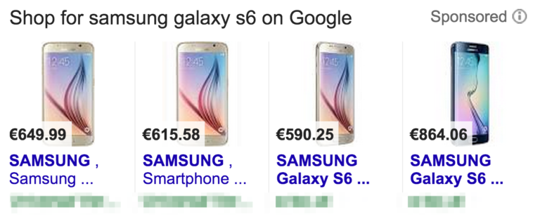
Title – Unless you’re the manufacturer of the product itself, don’t waste time or space putting in your company name. Customers don’t care. Use words that they would use when searching for the product, including the brand. Look at these shopping ads for the Samsung Galaxy S6 smart phone:

samsung-smartphones

Image Source: Whoopapp

Here, the customer is most likely to search the exact brand and model – Samsung Galaxy S6. Since you only have 70 characters, it pays to prioritize since only 25 of those show in the feed. So prioritization goes Brand Name > Exact Type of Product > Features/Characteristics – so the full product listing ad might read “Samsung Galaxy S6 Android Smartphone 4G”

Description – Here it pays to look at your product from the perspective of the customer again. Since they are likely only scanning quickly to find a match, it’s a good idea to make your description as visually digestible and helpful as possible.  This is a great place to put features that may not have fit in the title. Here, you want to do your best to answer any questions a customer may have about a product before they click.

Keywords – this is the perfect opportunity to dig deep into those reports and see which words your customers are using to find your product in the first place. Look at the terms that convert best and use those in your description where applicable.

Make Optional Attributes Part of Your Feed

Oftentimes, retailers mistakenly assume that if an attribute is optional, it isn’t necessary. But according to the ROI Revolution Google Shopping report, just because it’s optional doesn’t mean you shouldn’t include it anyway.

Google has a quality score for feeds – and while we don’t know the “secret sauce” of what makes up the algorithm, we do know that products which have all their information complete will have a better quality score than those who do not.  And according to ROI Revolution, certain optional attributes can help further optimize your feed and improve its performance and quality score.

The Alphabet Soup of UPCs, MPNs and Brands

The Universal Product Code, Manufacturer Product Number and brand of your items won’t likely be searched for by customers. They will, however, be used by Google to group and optionally compare products, like the cookware below:

skillet-google-shopping

Image Source: ROI Revolution Google Shopping Feeds report

Here you can see that even big-name brands like Macys, Sur La Table and Bloomingdales haven’t exactly done their homework on optimizing their product feeds. But as the report notes, take a look at Austin Kayak. Not only is it a Google Trusted store, which is an added bonus, but it also highlights their offer of free shipping and no sales tax.

You’d be forgiven for cringing when the thought of being stacked up there with your competition comes to mind. But Google Shopping calculates sales tax and shipping as part of the total – found in the “Total Cost” column. Businesses which offer free shipping and no tax automatically become the lowest price – even if they hadn’t highlighted their offer

Now the question becomes, can Google find your products and accurately compare them with others in the same price/feature range? Not if you haven’t taken the time to fill in the alphabet soup of brand, UPC and MPNs.

Size (And Color, and Material) Matter

Merchants are reluctant to input their products’ sizes into their Google shopping feed because they feel like they have to painstakingly measure things like width, height and depth. But at this stage in the shopping experience, customers only need to know the basics.  Consider these examples from the report. Size is important on all of them, but only general information is there for filtering purposes.

comparing-sizes-google-shopping

Image Source: ROI Revolution Google Shopping Feeds report

The same applies to color. Even if one of your products is “charcoal grey” and the other is “ash grey”, customers are likely going to simply look for “grey” and filter their choices accordingly;  not to mention that even Google’s filtering options tilt toward the very basic:

sweater-google-shopping

Image Source: ROI Revolution Google Shopping Feeds report

Material is another matter. Like size, you don’t have to be specific. As the report notes, customers aren’t going to care (in the beginning) about your 90% organic cotton blend when they’re simply searching for “cotton”.

There are many other attributes you can set that will greatly enhance your product’s performance (and therefore its sales and conversions) in your feed, including custom labels. To learn precisely how to set these, you’re encouraged to download the official report from ROI Revolution’s website (email required).

Are You Using Your Google Shopping Feed to the Fullest?

It can seem overwhelming to dive head-first into the details of your shopping feed, but as this report has shown, it’s the little things that matter most. Whether you have 5 products or 5,000, taking the time to submit them right can make all the difference in search, product listing ads and paid ads.

Are you using Google shopping feeds for your own products? How has adding attributes improved your products’ performance overall? Share your triumphs with us in the comments below and let us know your thoughts!

About the Author: Sherice Jacob helps business owners improve website design and increase conversion rates through compelling copywriting, user-friendly design and smart analytics analysis. Learn more at iElectrify.com and download your free web copy tune-up and conversion checklist today! Follow @sherice on Twitter, LinkedIn or Google+ for more articles like this!


from The Kissmetrics Marketing Blog http://ift.tt/1XcrLoN
via IFTTT